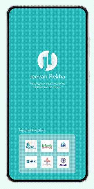
Jeevan Rekha- Now the entire hospital in an app- UX case study
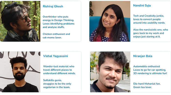
Rishiraj Ghosh
Nandini Syju
Vishal YagyasainiNational Institute of Design
ID’19
Course- Interaction Design


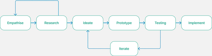
Overview
We created the Jeevan Rekha app as part of our Interaction Design Course’s 6-week Design Project at the National Institute of Design. We spent the next six weeks picking up a lot on the way, as we developed this app.
Jeevan Rekha is an application that is created keeping the bystanders or patient party in mind. The patient party has to run a lot of errands and communicate with the hospital management system to keep track of their admitted patient.
Jeevan Rekha connects the Hospital to the patient party so that they can track the hospital updates of the inpatient, remotely from their phones, maintaining their work-life balance.
Design Brief-
“To create a digital experience for communication with the Hospital body for Patient’s Guardian”
Secondary Research
We did preliminary desk research on Hospital Systems and their subsystems. Made diagrams and gained clarity on Hospital management processes. It was followed by observing typical interactions of people in hospitals.

Primary Research
After having an idea about Hospitals on secondary research, we -
- Conducted Field-visits to Hospitals
- Observed the environment and context of hospitals, their users, and their stakeholders
- Collected Pain Points
- Identified areas of Queue
- Interviews with experienced users in the domain


Defining
We did a brainstorming session on framing problem statements.
We proposed the problem statements, observed the correlation among them, and voted based on our Scope and relevance.
Problem Statement-
“Lack of transparency and compulsion in physical presence for communication between Patient’s Guardians and hospital system causing distress.”
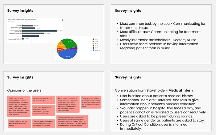
User survey
We created a User Survey Proposal with the questionnaire and intentions behind them and identified our target user.
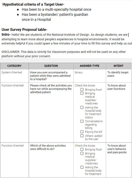
We conducted the survey and got insights on users’ previous experiences with hospitals, and opinions and attitudes for the system.
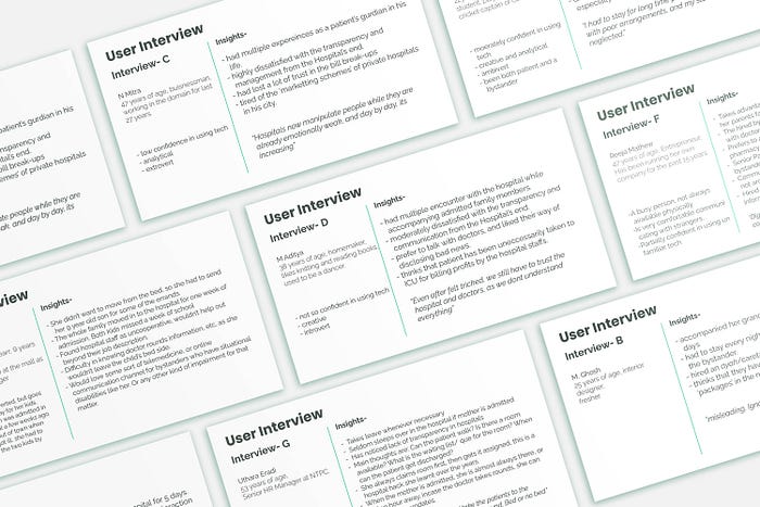
User Interviews
We recruited users for further interviews to get insights from their interviews.
User Personas
We identified behavioral patterns after conducting user interviews and made binary variables to be quantified on a Likert scale. This is followed by a recording of patterns observed on the behavioral variables.
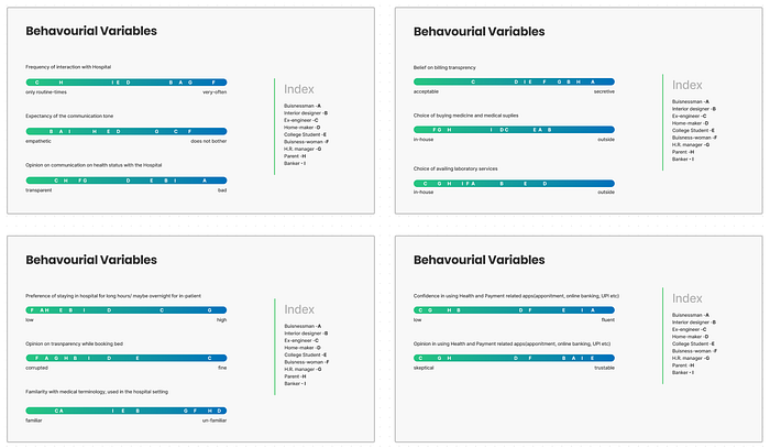
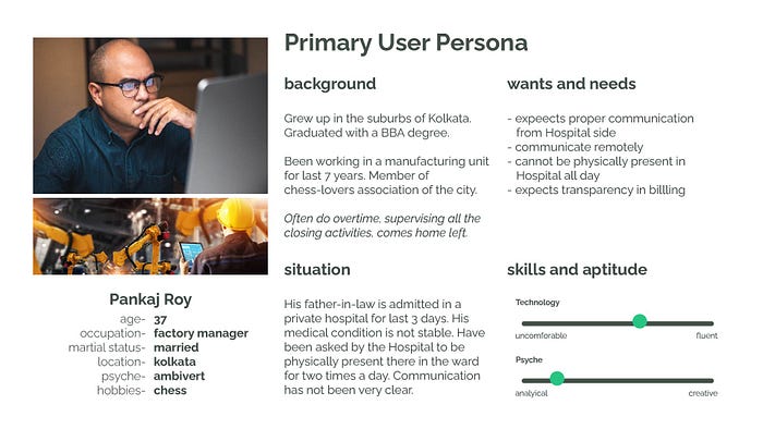
Finally, we created user personas on our empathize phase based on the aforesaid research.
From the observed principal pattern, we derived our Primary Persona.
Followed by Secondary and Tertiary Personas


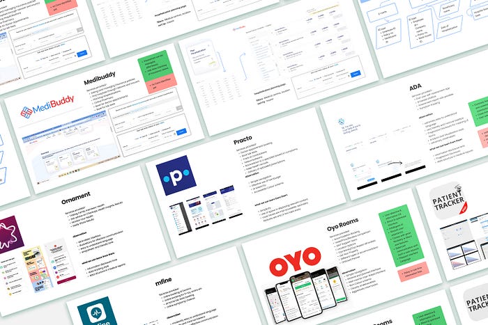
Competitive Analysis
We hypothetically thought of the services we are going to provide through our solution and identified potential competitors in the digital market.
We analyzed-
- Pros and Cons
- Information Hierarchy
- Common flows we can learn from them
- UX writing
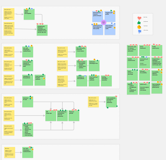
User Story Mapping
We tried to get into the user’s perspective and drafted stories, categorizing them into ‘needs to know’ and ‘need to do’.
And then further mapped them based on phases of the flow, i.e., before admission, communication, purchase-related for the hospital side. Parallelly we started exploring Feature listing based on the user’s needs and had another brainstorming session.
Feature Prioritization
We had a prioritizing session on features with MoSCoW analysis, with reference to the user story map and Scope.
We voted based on scored icons and categorized them into different feature priority(s).
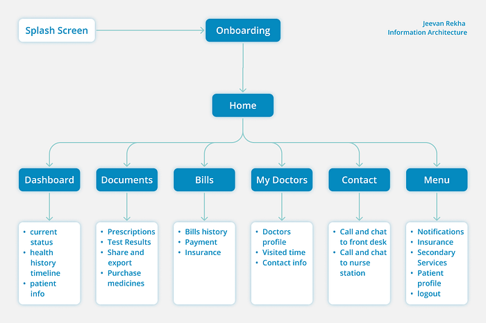
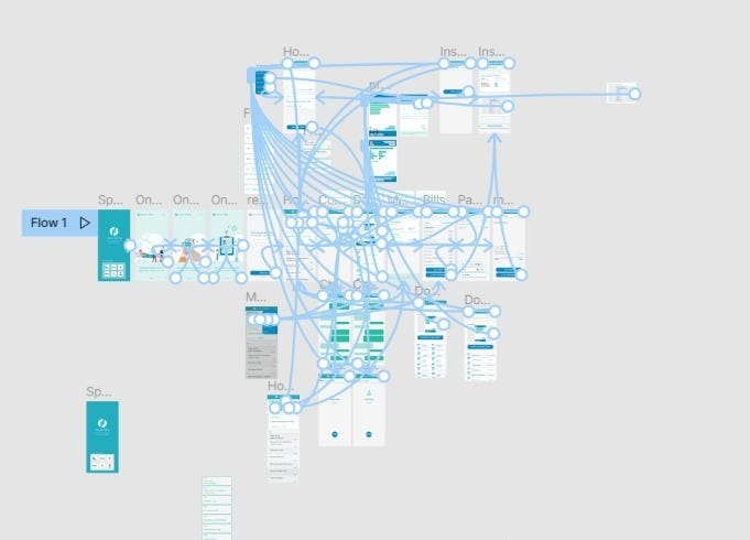
Information Architecture
We identified major tasks and planned journey maps, keeping in mind the decision points in between. We created flowcharts of task analysis of each action.
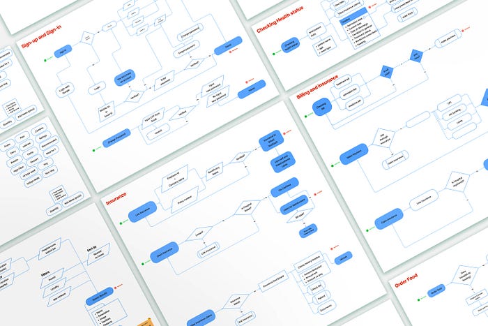
After some discussion, we made a couple of changes and added some new task flows to the journey.
After this, we identified the key-path flow in the journey, which includes the most priority user-flows with only primary features.
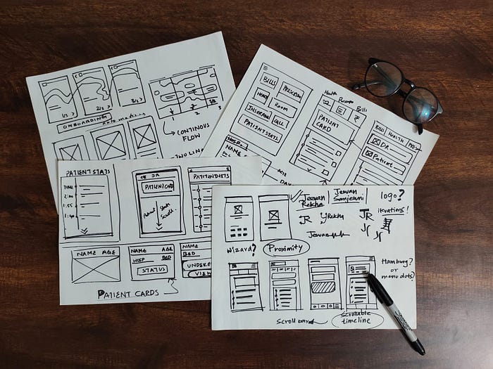
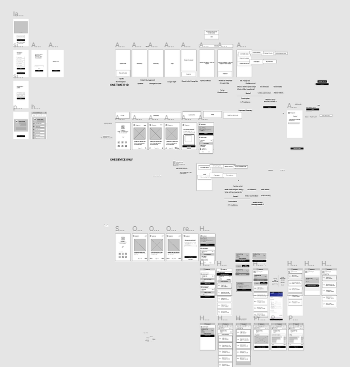
Low-fidelity wireframes
We kept our Information Architecture as the backbone and gave the user flows a 2D shape through wireframing.
We made a Use Case Scenario also, to make a detailed day-by-day story, to put relatable data into the product context.
We first sketched basic ideas of screens on paper and then refined them on Figma.
We further reiterated the low fidelity wireframes on Figma with intense brainstorming sessions, based on factors such as layouts, usability, intuitiveness, and hierarchy.
User Testing
After coming up with the wired key path flow, we went out for User Testing.
After round 1, we got feedback from our users. We observed how the users were interacting with our flows. We developed insights that indicated several drawbacks in our design in navigation and emphasis.
We made revised versions of our wireframes and then launched Round 2 of our User Testing.
We accomplished better interactions from the side of users and again made some more improvements.
High Fidelity
After validating our design, we went to create a Design System for our Hi-Fi screens.
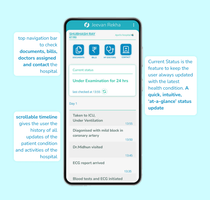
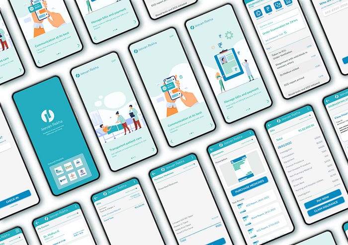
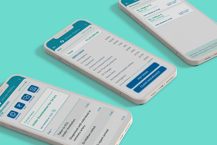
Our Final Prototype
direct link- https://www.figma.com/proto/CUbuddC5QYTB6lfzj4Nqlf/Jeevan-Rekha?node-id=61%3A2017&starting-point-node-id=61%3A2017
About the Team
Thank You!